Cover stories
The Sister.
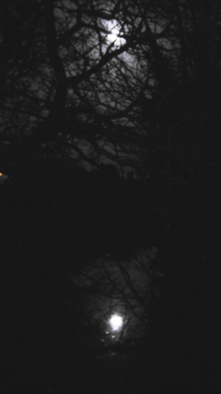
I took this photograph as I arrived outside my home one cold February night whilst I was still writing The Sister. I knew I had to fit it into the book cover background somehow.

It went through several different forms...

Originally released as the version above.

Revised the layout after a couple of months...
Before handing over to a graphic designer to create the one I have now. If you compare the image to the original photo, you can see the trees are unchanged. I love how he got a grasp on the storyline and added his visual interpretation by way of the phantom. I guess when you're a graduate of the Royal College of Arts that kind of creativity is second nature.
The Life and Times of William Boule.
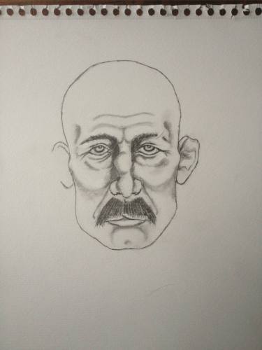
This cover idea began with a sketch by a friend of mine, Chloe McDonald and aligned with a scene in the story where Carla goes to an acquaintance, a police artist to get Boule's likeness sketched for some posters she plans to put up in Morocco.

This was the original cover designed by the same artist who'd put the final cover together for The Sister. But I had misgivings about the 'Bestselling' statement. The Sister sold well, don't get me wrong - and it still sells, but bestselling is too subjective. So I had another look at it.

I liked the darkness of the crazed background. Matched the mood of the piece, but still I wasn't happy.
So I finally found a picture close to how I see Carla, kept the crazed background and rereleased it with the her image on the front instead.
The Night of The Mosquito.
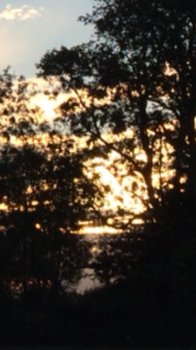
The sunset caught my eye, I loved the play of the light through the trees, creating all at once an illusion of fire and beneath, a mirage of water.By now I've decided that all my future covers will feature a backdrop photograph that I've taken.

Not my colour, but you can see the background clearly.

The background didn't show throw enough!
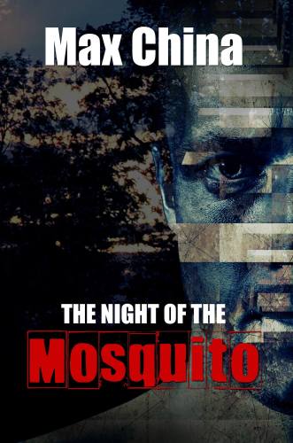
Got the background in exactly the position I wanted, but not menacing enough...

That's what I was looking for.

